Paytm Money • Growth • Fintech
Bonds launch campaign: growth strategy and design
- Visual Designer and Lead
- 3 designers, 8 growth marketers, 1 content writer, 1 PM
- 2 months (beta to launch)
- Homepage-to-Bonds CTR, 5% to 12%
In short
I led campaign design for the Bonds launch across two apps (Paytm App & Paytm Money App) that shared a brand but not an audience.
I mapped the campaign to the funnel, built templates so a small team could make creatives for every placement, target audience, and tested them every day with the growth team.
One campaign, two apps
The Paytm app has 333M+ registered users, and most of them came to pay for something (Bills. electricity, mobile etc).
Paytm Money is where people who already invest buy stocks, mutual funds and gold. The same banner could not do both jobs.
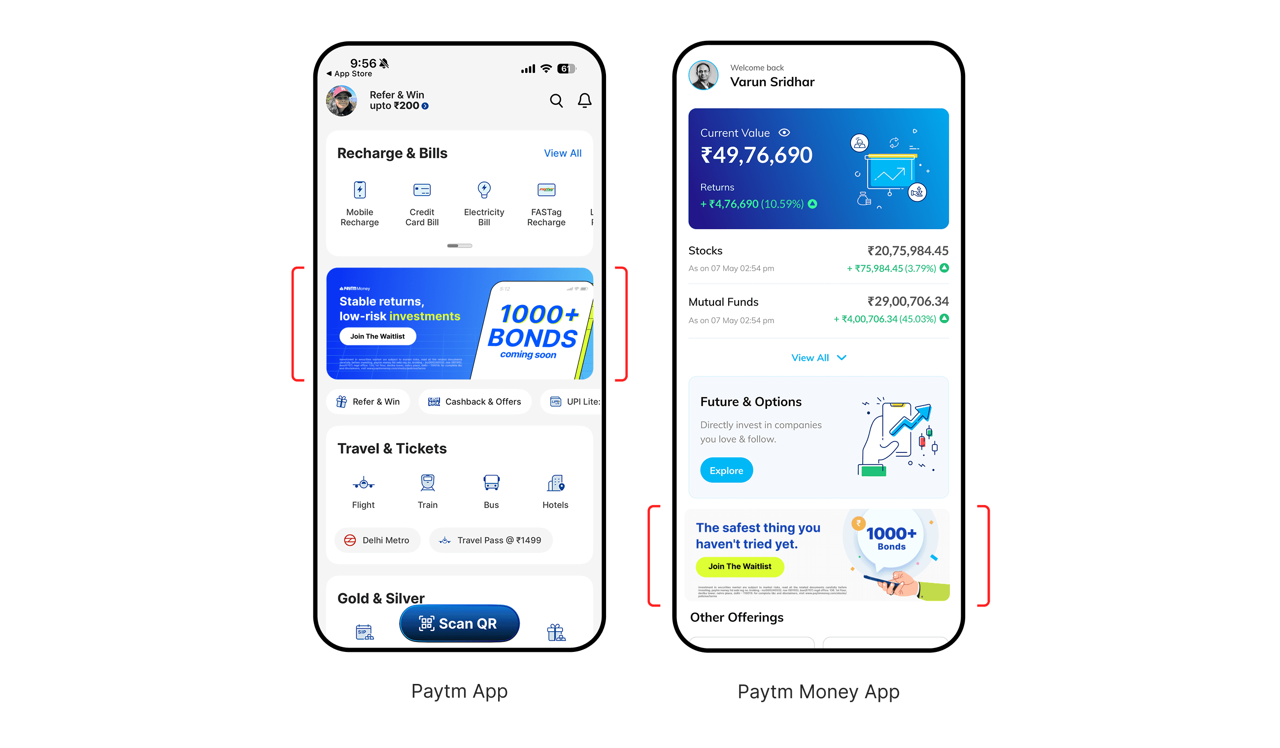
So I split the campaign by audience before I split it by placement. Each audience came with a different first question, and every creative had to answer it.
Payments users on the Paytm app
What is a bond, and is it safe?
“Stable returns, low-risk investments.”
Stock investors
Why hold something that pays a fixed amount?
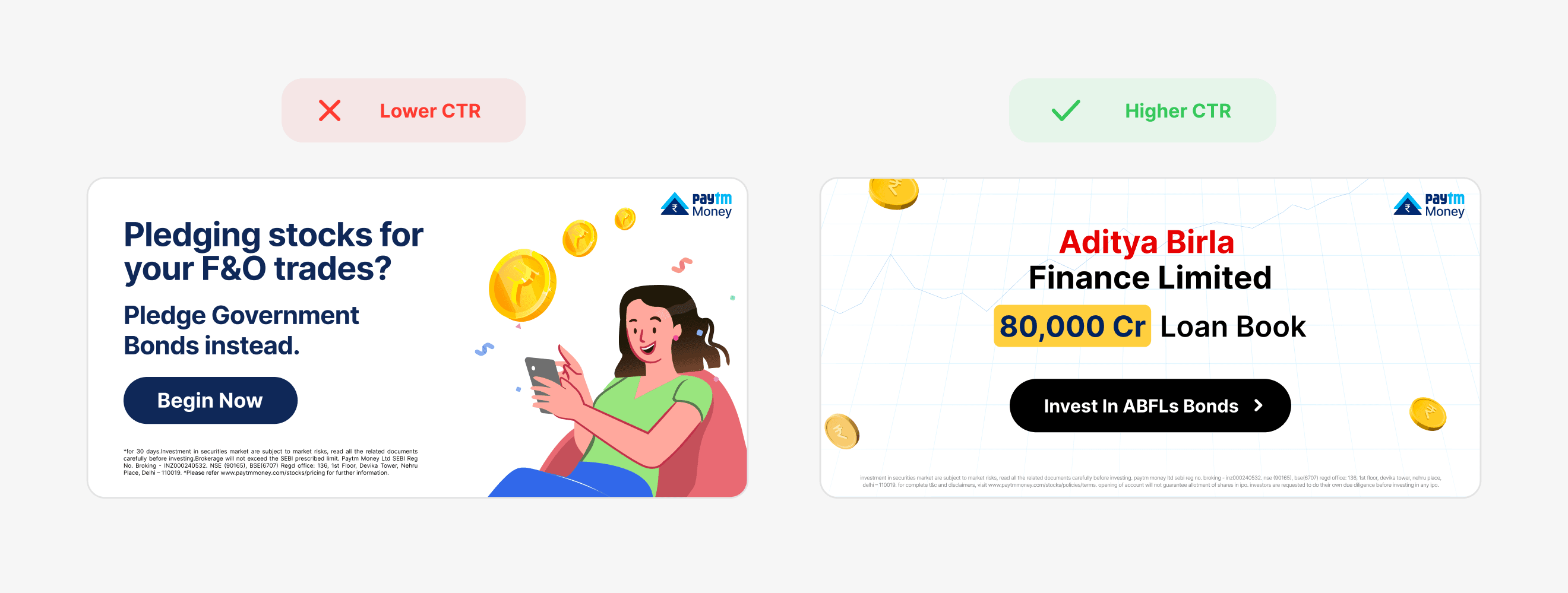
“Pledging stocks for your F&O trades? Pledge Government Bonds instead & earn interest alongside.”
Mutual fund investors
What do I earn, and when do I get my money back?
“Build a portfolio that stands the test of time. One bond at a time.”
Gold buyers
How is a gold bond different from buying gold?
“Earn gold returns + 2.5% p.a.”
FD savers
Can I earn more than my fixed deposit?
“Earn more than HDFC Bank FDs.”
Campaign in phases
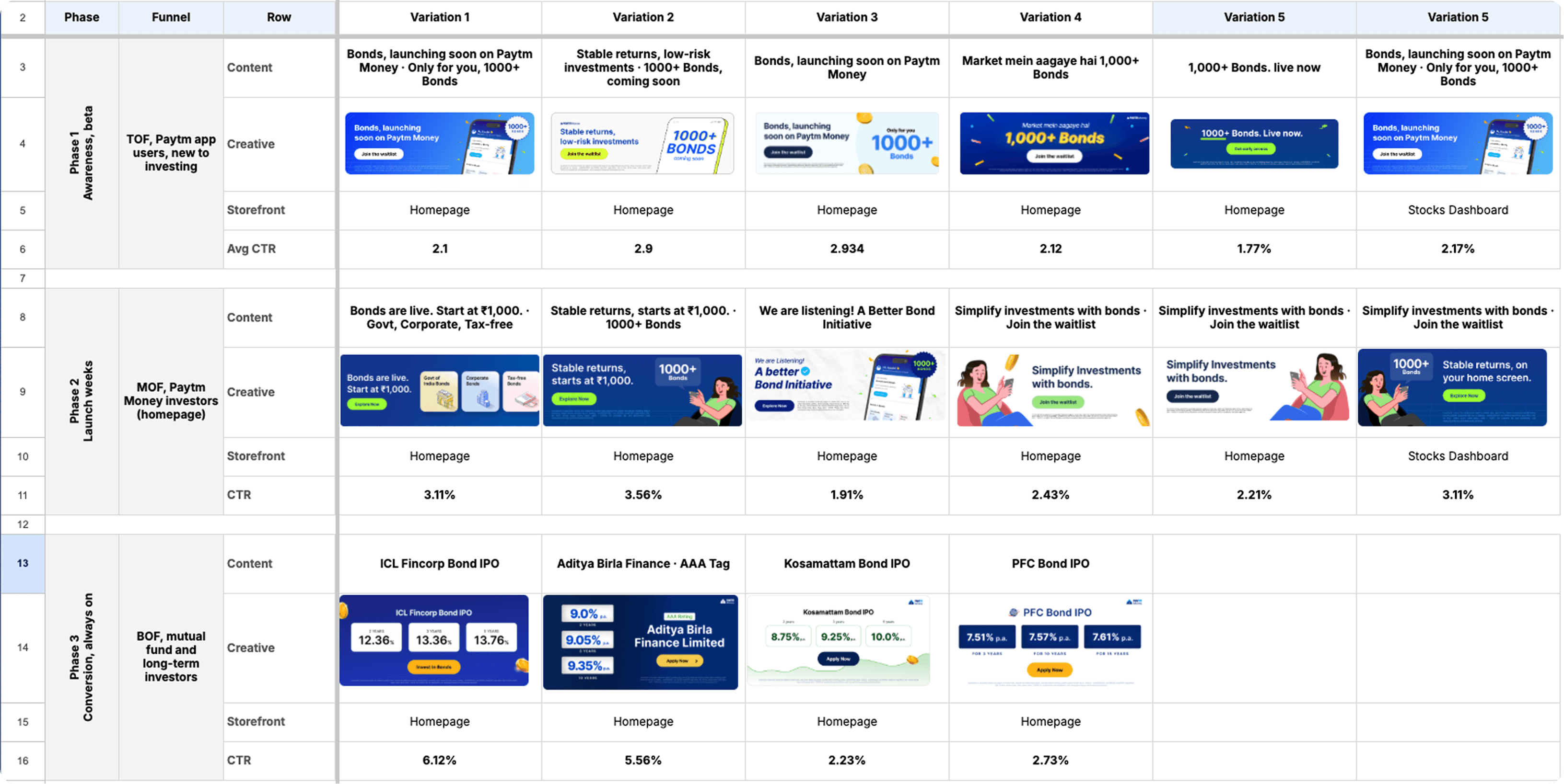
A new category can't run on one message. Users at the top of the funnel had never heard the word bond, and users at the bottom of the funnel were comparing rates. So each phase got its own job, message and signal of success.
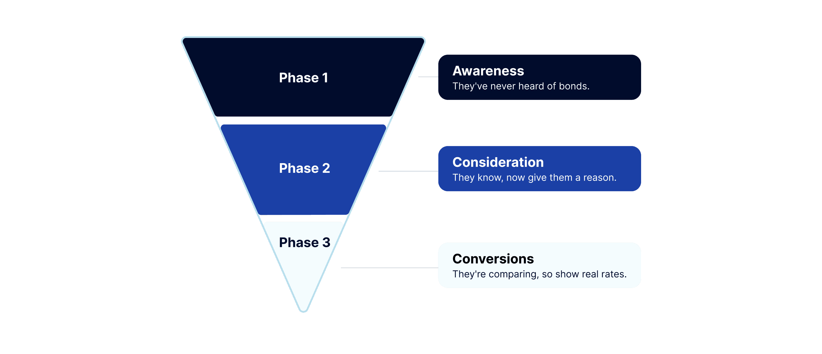
Phase 1 · Awareness, during beta
Job
Make an unfamiliar word worth waiting for
Message
“1000+ bonds coming soon.” CTA: Join the waitlist/ Join early access
Metrics I watched
Waitlist joined
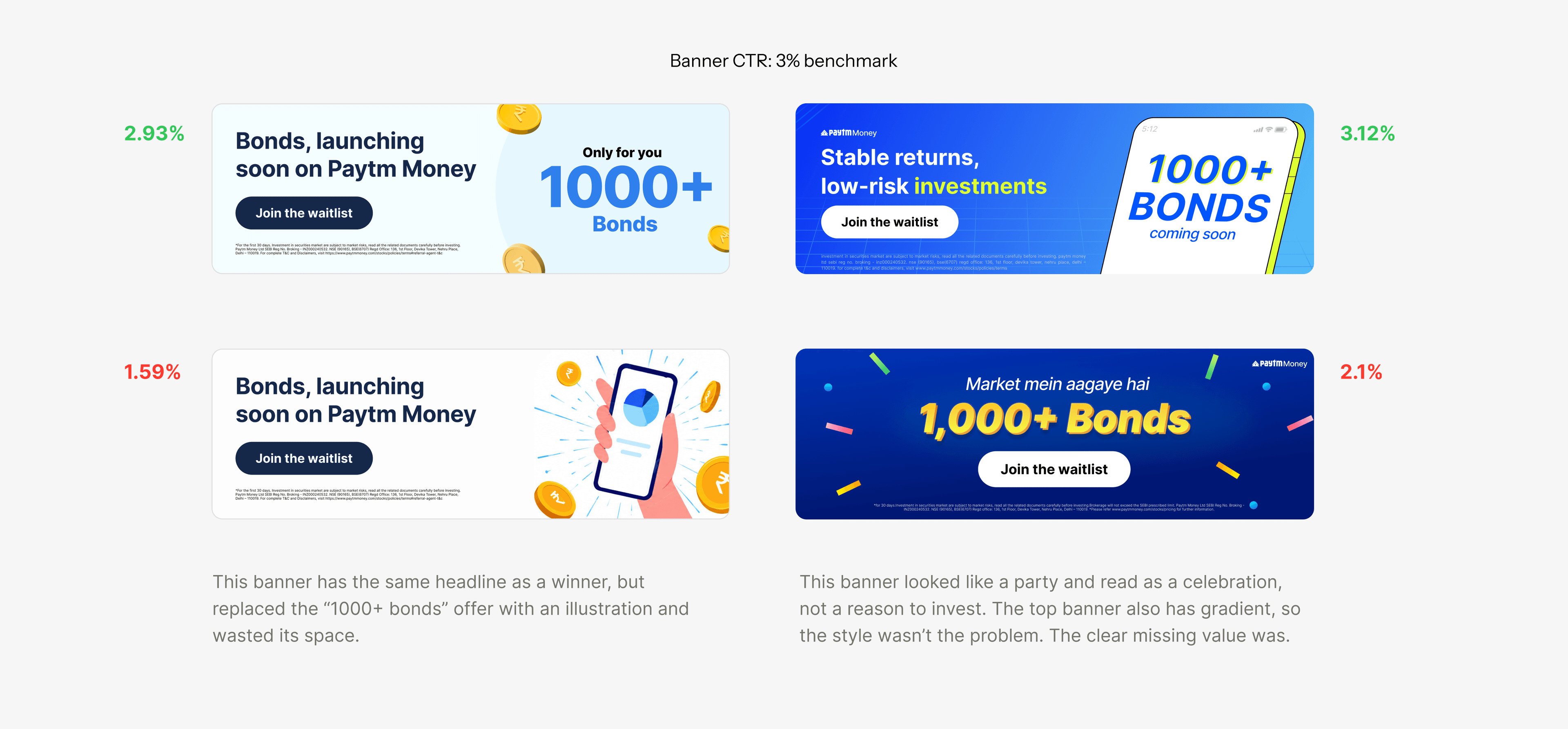
The lesson: To say what the investor gets before anything else, clear and actionable.
Phase 2 · Launch weeks
Job
Turn curiosity into a first look
Message
“Bonds now live.” CTA: Explore now/ Explore bonds
Metrics I watched
Clicks from the homepage into Bonds Page
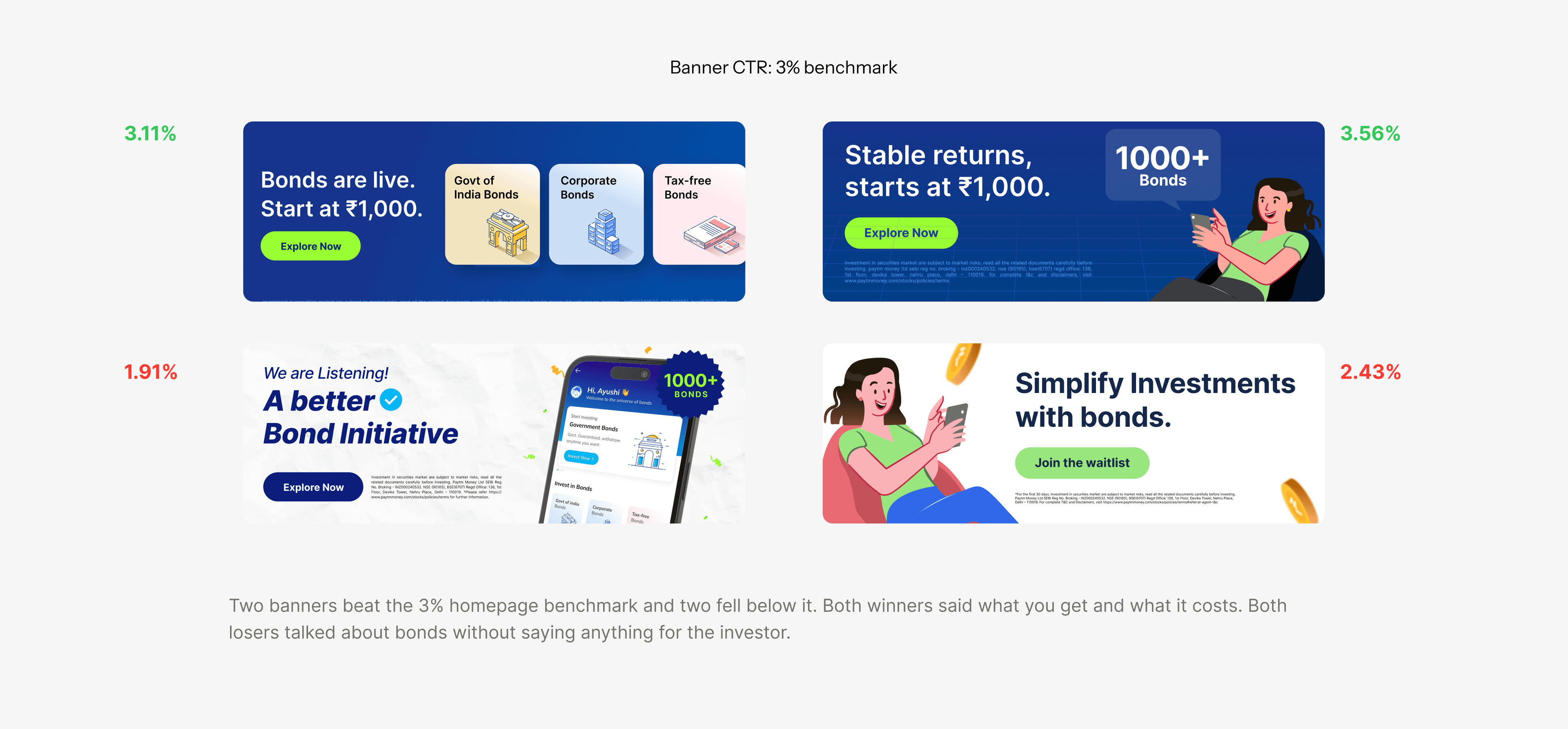
The winners took the homepage slots, and I adapted them for each audience, so a stock investor and a gold buyer saw the same offer framed for them.
Phase 3 · Conversion, always on post launch
Job
Give them a real reason to buy bonds today
Message
A real bond: issuer, tenure, amount, rate. CTA: Invest now/Apply now
Metrics I watched
First bonds orders
Lenders people didn't know led with the rate. Big names led with their size, like Aditya Birla's 80,000 Cr loan book. A busy IPO led with how many people had already applied.
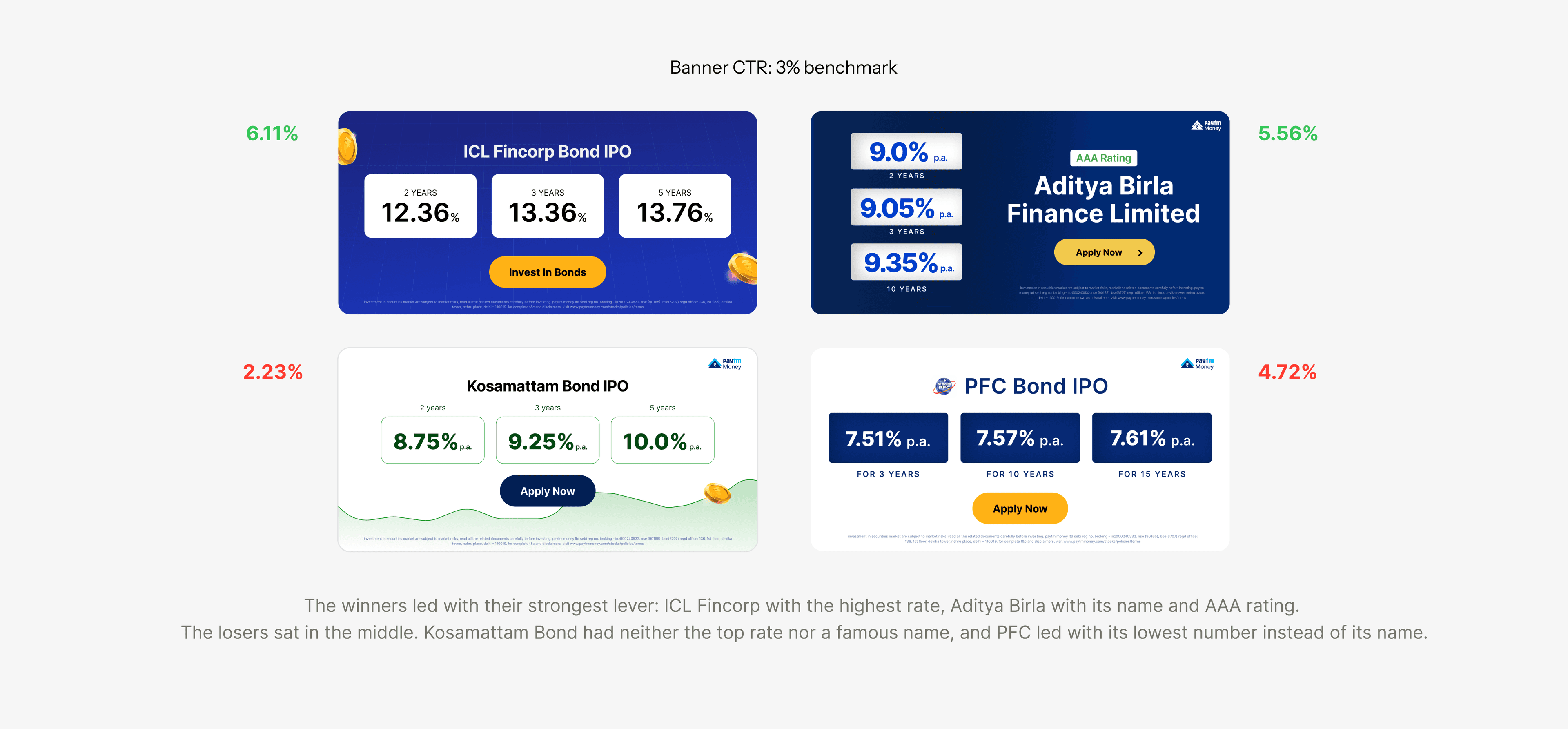
After launch, the campaign became an always-on stream. The growth team picked bonds to push, like a new issue or a government bond for a specific audience, and the templates turned each pick into a set of creatives to test.
Browse abandonment pushes (rich push notifications)
Many users opened a bond, checked its rates, and left. So I designed rich pushes, notifications with a large image, that picked up where they stopped: the same bond, its rate or its name, and a tap that opened that bond’s page. Regular pushes ran at about 5 to 6%. These reached about 12%.
Opened a bond type and left without investing
That Bonds's real rates, ratings, FOMO push, etc
Opens the same bond screen, not the homepage
Push CTR, from ~5% to 12% CTR for return users.
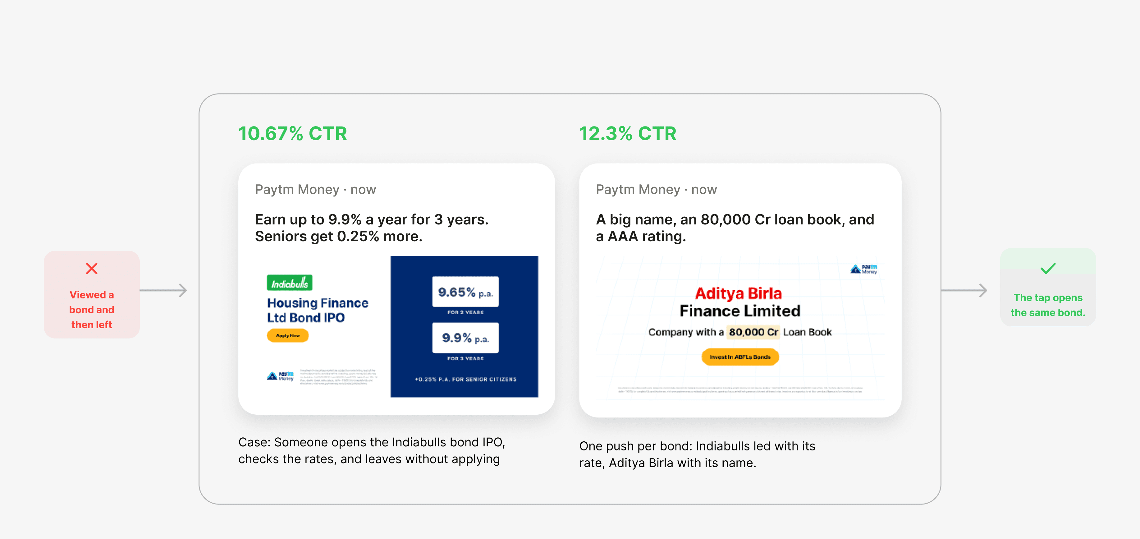
What the tests kept rewarding
No single banner moved the CTR. A set of beliefs did, and each one held up test after test across audiences.
People skip what they dont understand
One message per creative, in plain words, with less text
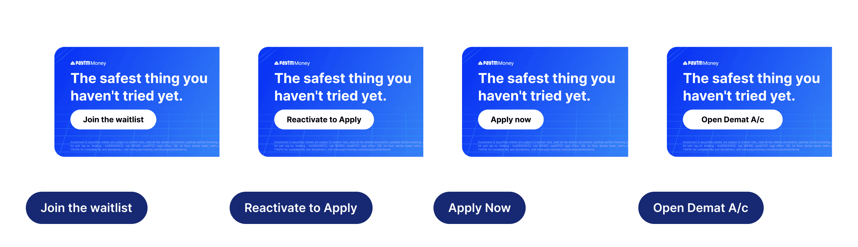
A clear next step
Every creative ended with invest/explore/join
People buy for what's ahead
Communicate ‘future income’ instead of features
Seeing the product builds trust
Real app screenshots, large enough for a banner on phone
A human touch makes money feel safer
Hand-drawn illustrations instead of stock finance art
Familiar brands get a second look
One brand system across both apps and every placement
People should know it's bonds at a glance
The product's own design system carried into the ads
Testing every day
I tested creatives with 8 growth marketers every day, and every result could overturn what we believed about an audience. What worked for stock investors often failed for gold buyers, so each audience kept its own hypotheses.
Start from one belief about one audience.
Build two or more variants from the same template, changing ONE thing.
A/B test them on the same placement.
Read the CTR with the growth marketer who owned that audience.
Keep the winner, drop the loser, and rewrite the belief if the result surprised us.
From the ad to the app
A click is only worth something if the page that opens keeps the ad's promise. Someone who tapped a Muthoot ad landed on the Muthoot card and saw the same numbers.
I designed both, so the campaign and the product read as one story.
Campaign’s other channels
The campaign was promoted on other channels outside the app. My role was to keep the design consistent across all of them: multiple emailers based on what people invest in, WhatsApp and Telegram channels, the app’s splash screen, social media, Instagram Reels and YouTube Shorts, and standees.
A template for every placement
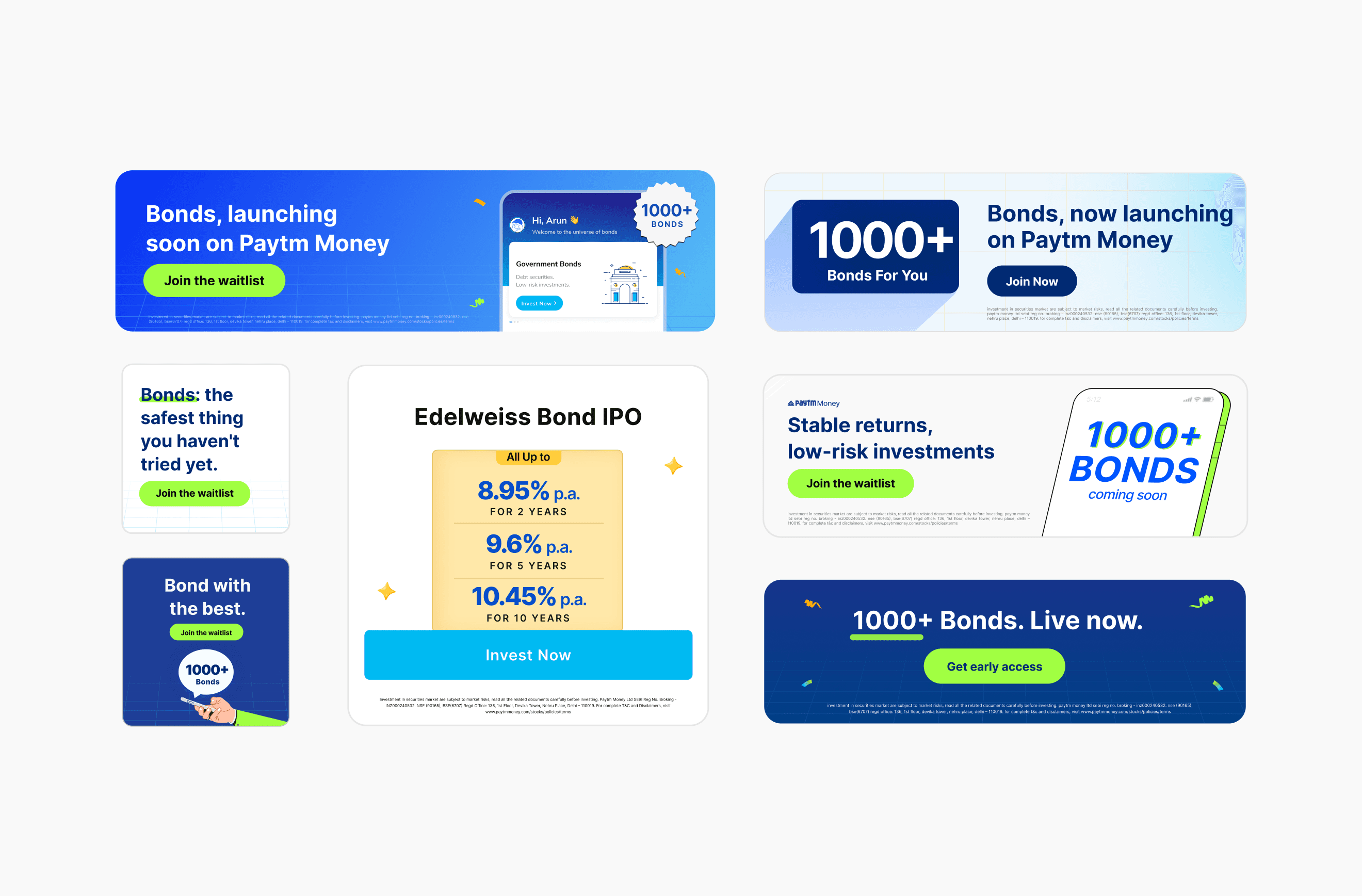
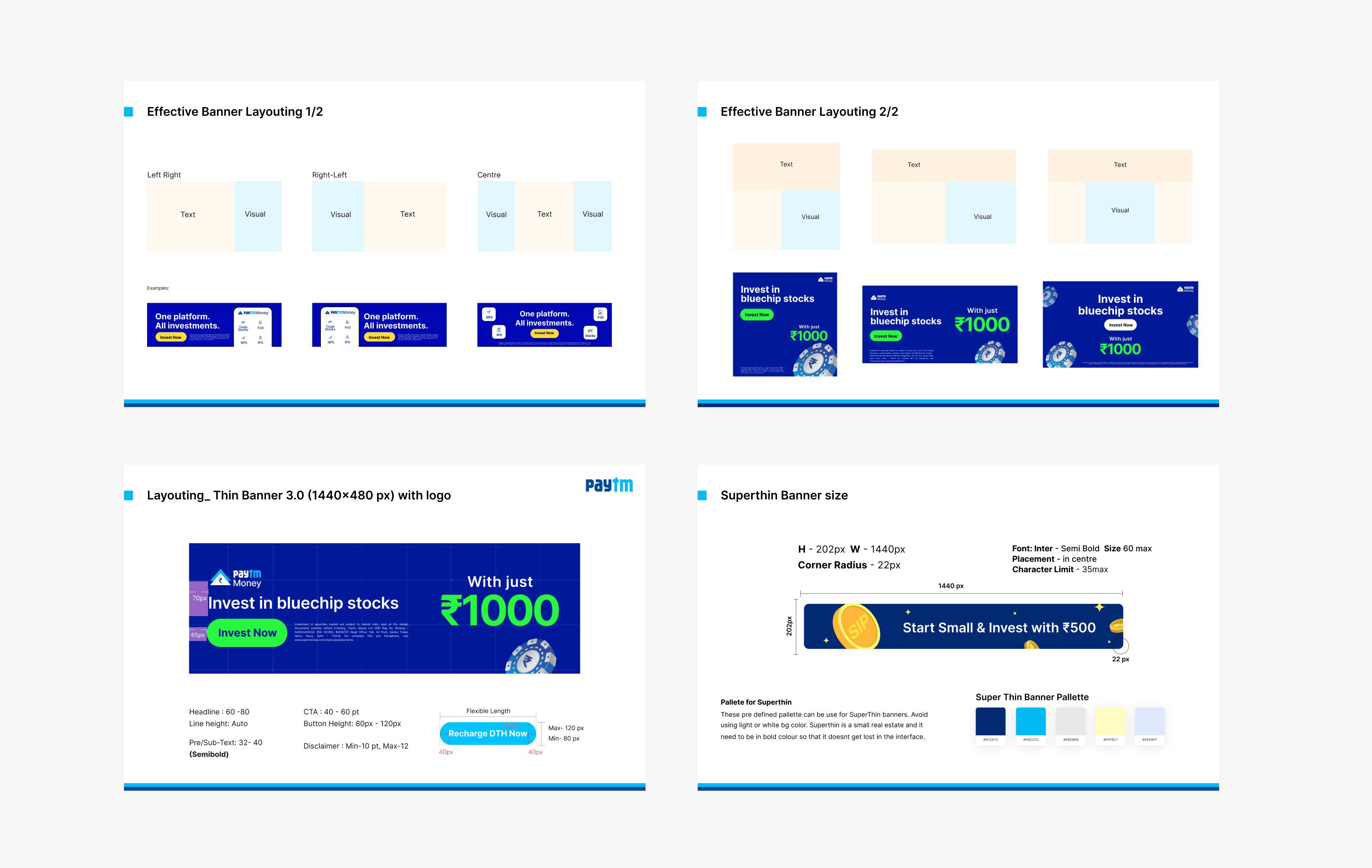
Every launch campaign had more than 500 creatives across 20+ properties, so I built a banner design system as templates, standardised and scalable across all of them.
Each template fixed where the illustration, the message, the call to action and the disclaimer sat. In-app banners, emailers and push notifications each had their own. Ads outside the apps, like Google Ads, were built by hand when needed.

Results
- 5% → 12%
- 500+
- 20+
What I'd do now with AI?
The campaign ended at the first order. Next I'd add a fourth phase for people who already bought: a note when interest is paid, and a nudge when a saved bond changes.
Today I'd also use AI to draft variants inside the templates, so the team spends its time choosing what to test instead of resizing banners.
I'd also close a gap the product had already solved. In the ads, the highest rates often ran without their rating. The product card puts the rating next to the name, and I'd bring that rule into every creative.