Paytm Money Bonds Campaign
Designing the whole funnel, not just the ad
Role
Visual Designer & Lead
Team
3 designers,8 growth marketers,1 Content writer, and1 PM.
Timeline
3 months(from productLaunch)
Introduction
Bonds launched on Paytm Money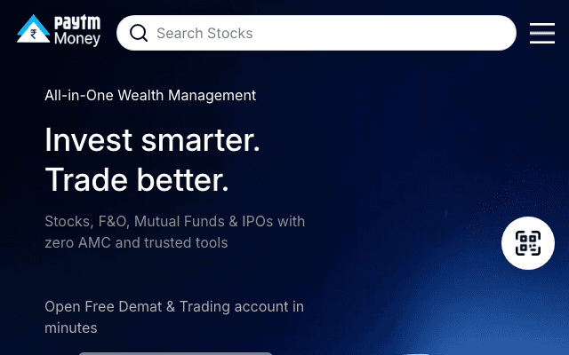 paytmmoney.com in 2022. The product was almost ready, and my job was convincing people to care about a category most of them had never bought.
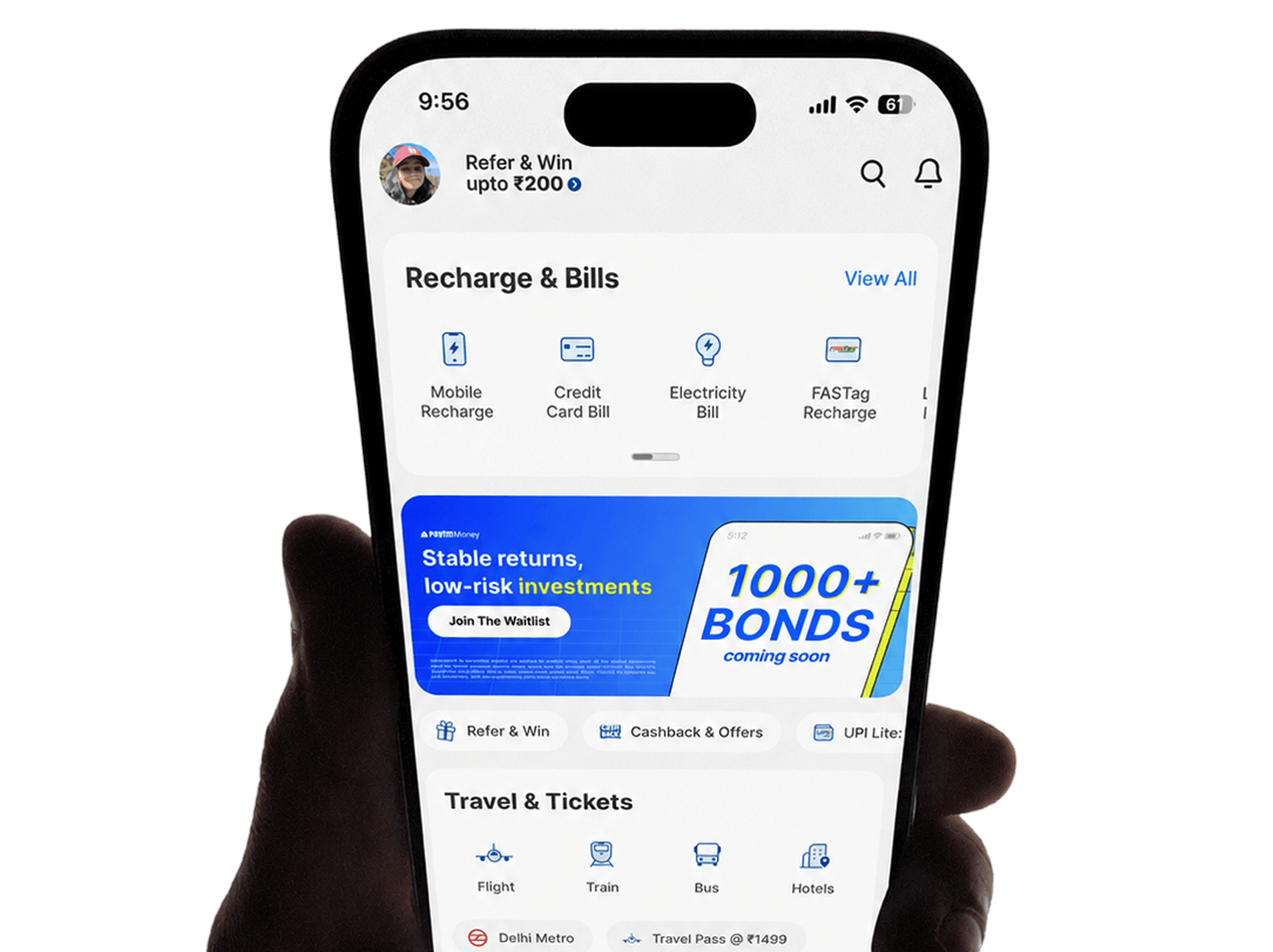
I led the campaign design and visual communication for the launch, across both Paytm Moneypaytmmoney.com and the main Paytm app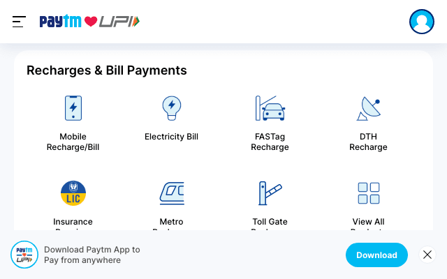 paytm.com. Same brand, but two very different audiences.
Impact
2.4x
5% to 12% increase in CTR. Homepage-to-Bonds page.
500+
Creatives tested on more than 20 properties
One campaign, two apps
Paytm Money has roughly 4M+ users who already invest. The main Paytm app has 333M+ registered users who mostly came to pay for something.
The campaign had to do two different jobs: introduce a category to payments customers who had never bought a financial product, and drive action for investors already inside the investing app.
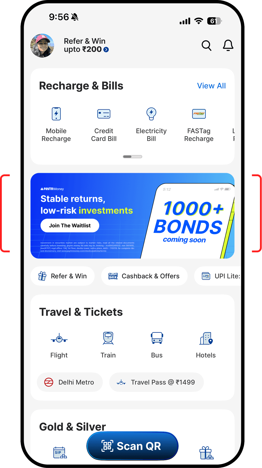
Paytm App
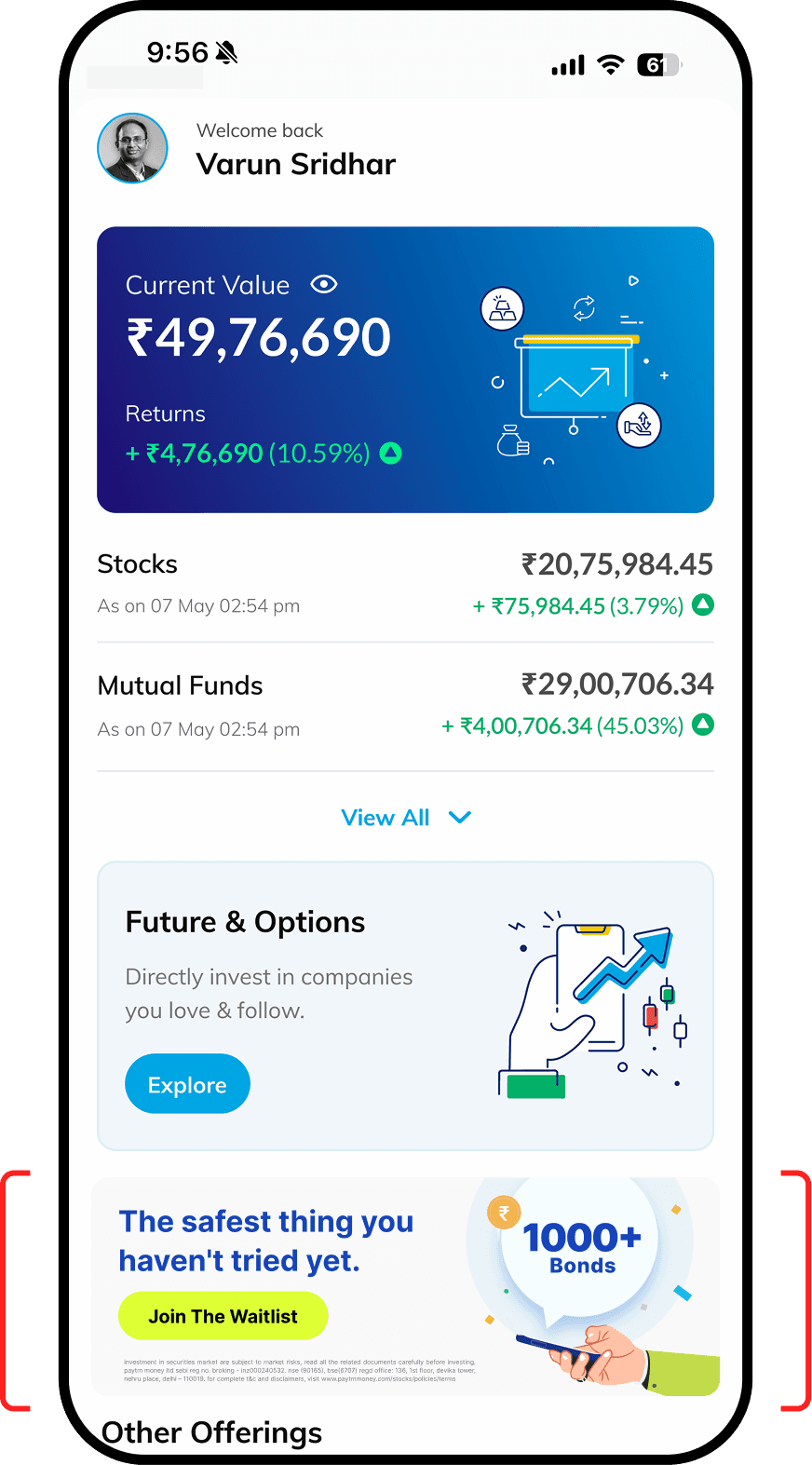
Paytm Money App
Three campaign phases
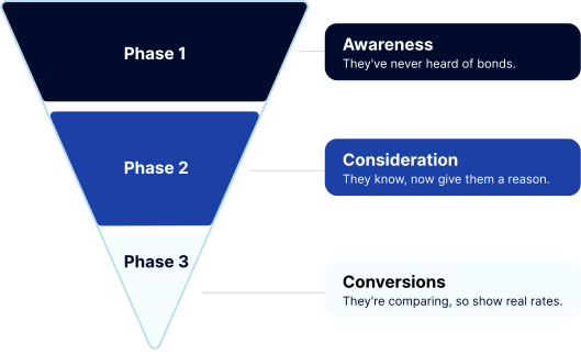
Bonds was a new category, so we couldn't run one single message. Someone at the top of the funnel had never heard the word. Someone at the bottom was comparing rates against a fixed deposit.
So we mapped the campaign to the funnel. Awareness before launch, consideration at launch, conversion once bonds were live. Each phase got its own message, its own creative treatment, and its own placements.
Phase 1 - Awareness
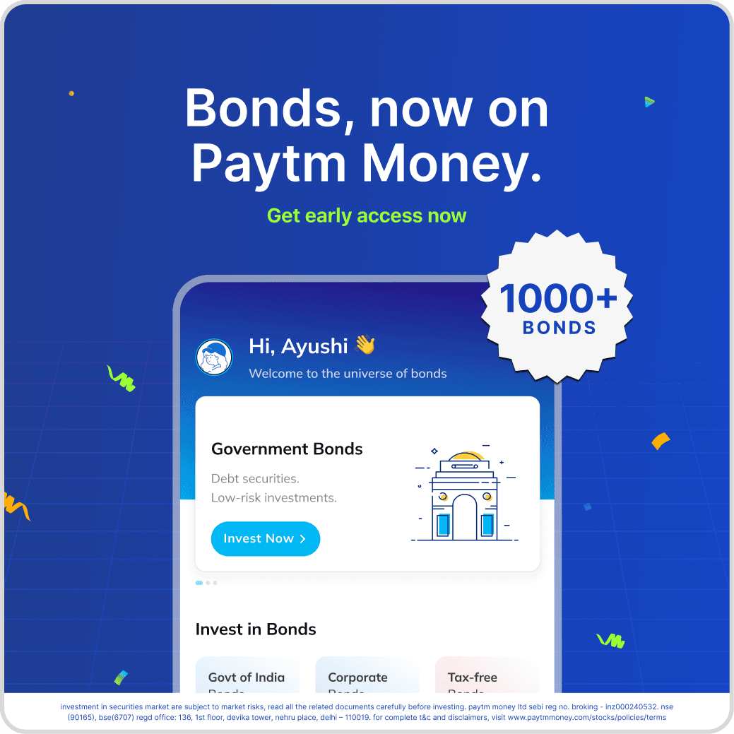
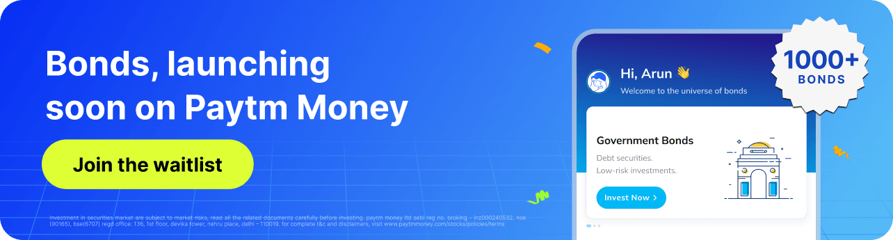
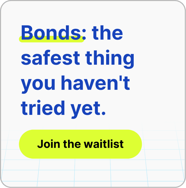
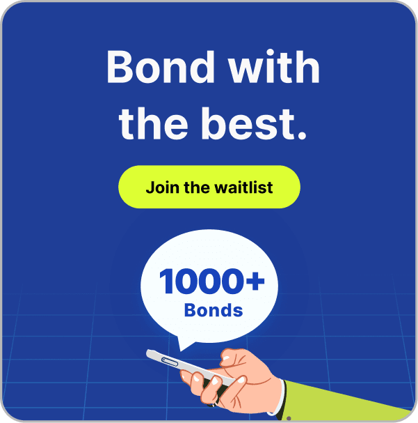
The job was making an unfamiliar word feel like something worth waiting for.
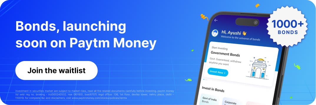
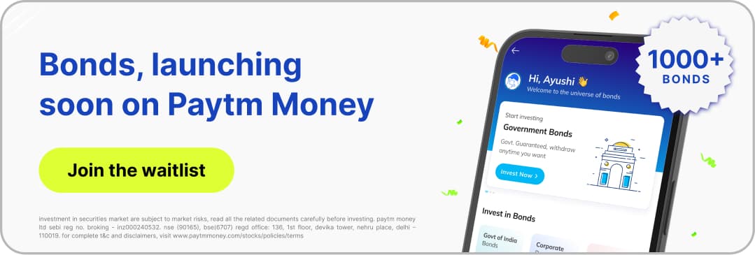
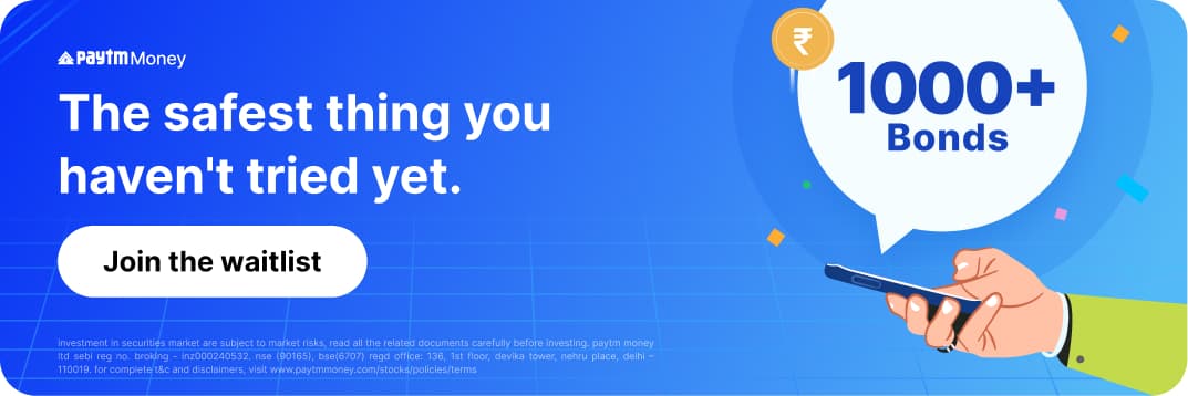
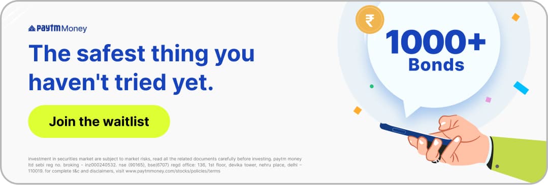
"1000+ bonds coming soon."
"Bonds, launching soon on Paytm Money."
"Join the Waitlist"
Placements: in-app banners across both the Paytm and Paytm Money apps, social media, blogs, webinars, and video.
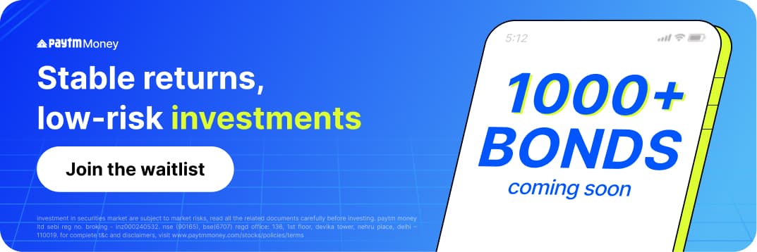
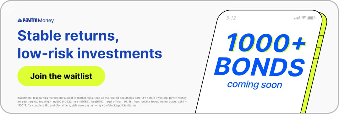
other properties on both the apps
Phase 2 - Launch Week(s)
"Bonds now Live."
“Get early access.”
“Explore Now.”
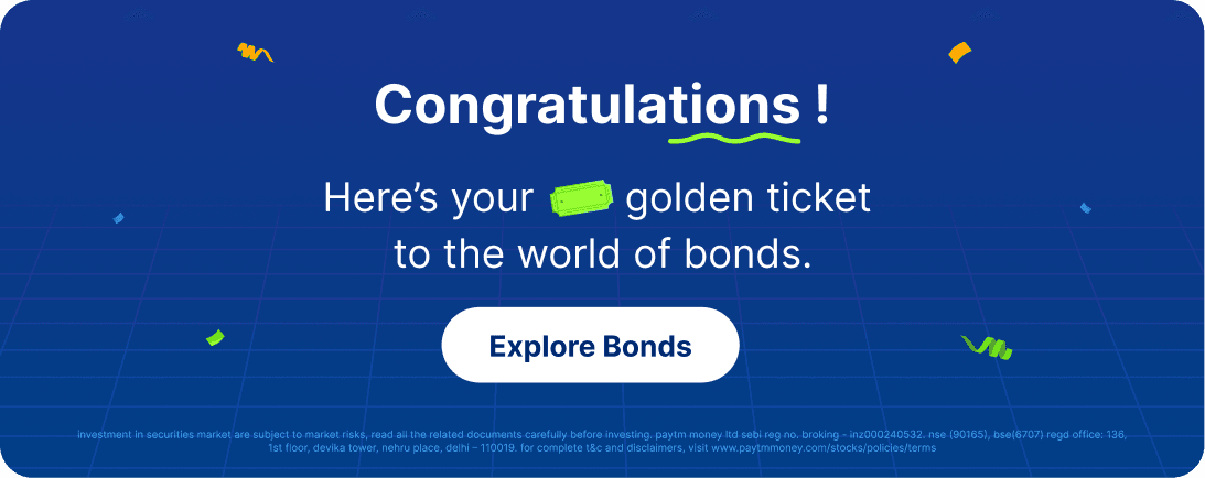
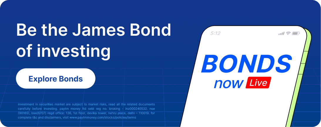
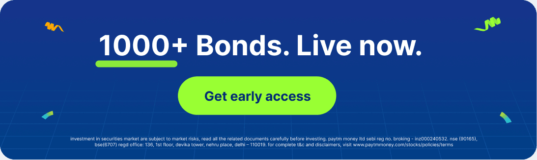
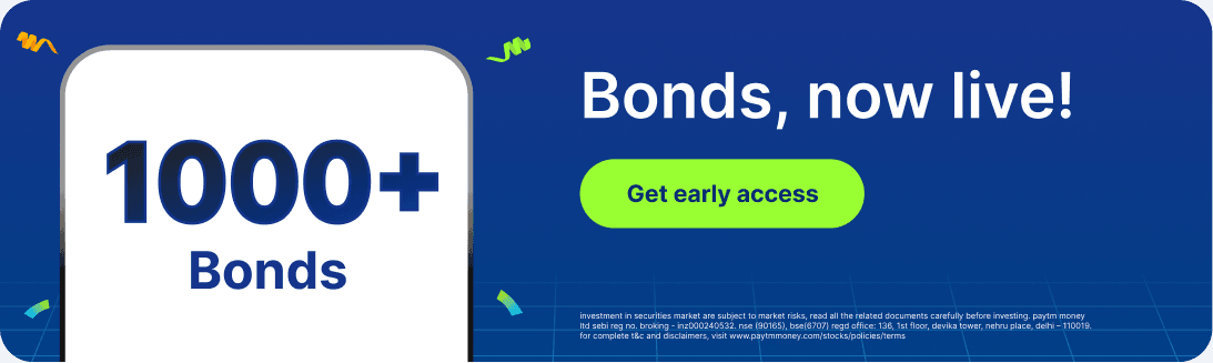
Creatives moved from curiosity to action: stable returns, low-risk investments, explore now. We continuously tested different creatives on different properties to come up with the best performance creatives and leverage those.
Learnings: the blue or darker background creatives worked better on popular properties, hand/human vector illustration, pop of red, numbers (1000+ or ₹1,000) - worked better for the CTR.


Standee Design
Emailer
Carousel
Phase 3 - Conversion
After launch, we made the campaign more specific, converstion oriented.
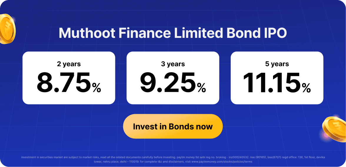
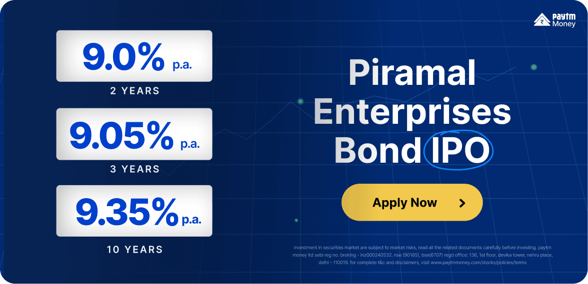
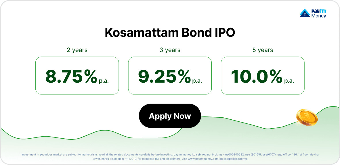
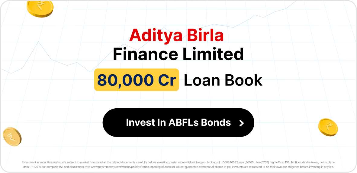
"Bonds highlight of the day" ran with a real issuer, real tenure, real rate. Tax-free bonds trading today. Issuer-led creatives like "choose from over 19 Tata bonds" borrowed recognition from names people already trusted.
This phase is where the product research showed up most directly. Company name first, then the three numbers customers actually check: tenure, amount, rate.
Iterations & Growth learnings
Most of these creatives went through several rounds of A/B testing. Same layout, different emphasis: green rate numbers versus blue or red, tighter versus looser hierarchy, black CTA versus green.
We tested creatives the same way we tested the product, watching what people noticed first and what they skipped.
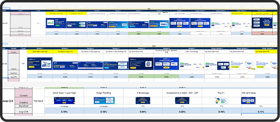
snapshot of the testing plan
Let's see the Bonds Project
These campaigns brought people in. Here's the product they landed on, and how it was built.